From the Streets to the Seats
Transitions Program Book
This book design, From the Streets to the Seats, was created for the Transitions program at MiraCosta College in 2023. Being the graphic design intern for this project, my role was to design the whole book by the cover and the interior layout of text; as well as working closely with the printing process.
The Transitions program provides support for people impacted by incarceration. Students are given access to financial, academic, and psychological resources to achieve personal and educational goals. The book itself is made up of life stories written by the students in this program and would be the first edition of this program.


Meeting with the authors, was immensely better as it allowed me to better understand where they are coming from personally rather than broadly. Asking them many questions, they would provide many suggestions for the what the book cover look like. They also changed the new title to From the Streets to the Seats.
Any symbol of imprisonment is something they wanted to get away from. Rather, they want a sense of breaking away from it. Trying to honor all their request, I would then move forward forming new ideas in which I would go back to sketching and created a new moodboard.


Initial Digital Concepts Shown in Next Meeting
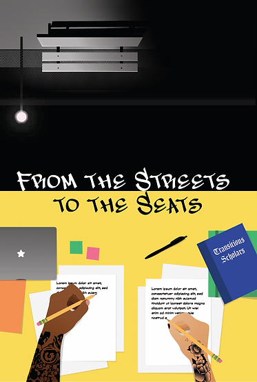
Option 1: The cover expresses the transitioning from the incarcerated life to higher education by having the top represent the isolating and the dark side of the Streets life. In contrast, the bottom shows a bright future of two hands with school supplies to represent the new scholar life of the authors. The style was the only option that was more naturalistic.
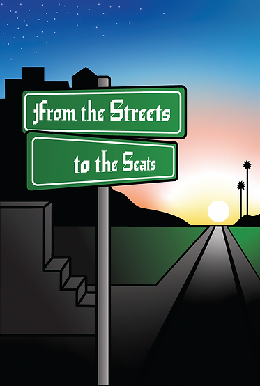
Option 2: The cover expresses the journey to new horizons when going from the Streets life to scholarly life. That is represented through the road up to the sunrise. Also, the palm trees are there to represent the California setting that would be familiar to the targeted audience.
The style was meant to be more graffiti, cartoon-like.
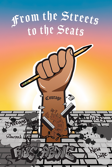
Option 3: The cover expresses breaking free from the past incarcerated life through a hand breaking through a wall filled with graffiti. The hand is holding the pencil to symbolize higher education and achievement. The tattoos are intentional in bringing a hopeful message as well as the graffiti words. The style was also meant to be more graffiti, cartoon-like.
During the meeting, Option 3 was chosen for the cover. For Option 3,
I was given more feedback to add more elements to the piece. For interior, there was not much extra suggestions; therefore, I continued further with the interior layout and revealing the refined version in the next presentations that show the whole layout.
Final Cover Design


The tattoos on the arm are inspired by the author's style and the style in the culture. The tattoo on the clock is supposed to represent time served in prison. However, the clock has been broken as birds fly out of it representing the freedom from incarceration and a sense of freedom as the birds flying into the sunrise. Likewise, the added broken chains strengthens
that idea.
The graffiti on the wall was hand rendered as I drew the letters on paper and then digitized it. The words are all purposefully meant to bring a positive message as some say "New Life" and "Together we Rise." The tagging was done using the font, Subway NewYork Std.


Final Interior Design


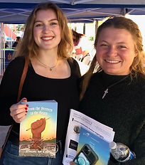
Implementing elements from the cover, I added the tagging font and created pull-out quotes throughout the text to create visual interest of great thoughts in the stories. After completing the design, I worked closely with L+L Printers to ensure the printed version was satisfactory. This would mean multiple trips to the building and going over the exposure of the photos and other type errors. After all that, the books would be able to be sold at their launch event in which was quickly sold-out after two days!
The authors are very thankful for the work that I have done and feel like I represented their voices well. Many will go on to be motivational speakers and activists for the war of drugs. This has been such an honoring project to be a part and one I learned a lot along the way as a graphic design intern.